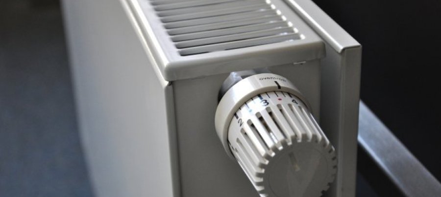
Keeping progress visible
It's essential to make the progress made during a sprint or iteration visible to the team and to the product owner or onsite customer. This can be achieved with Big Visible Charts. I consider the minimum charts to be a burn-up or burn-down chart and a chart showing the acceptance tests passing or failing.1. Burn-up or burn-down chart
Both types clearly show status and velocity or rate of progress against predications, and provide a visible indication of whether the team is going to finish on time, early or won't finish everything they committed to do. They facilitate early conversations with the onsite customer or product owner regarding a de-scope of user stories from the iteration. I like to have 3 variants of the chart on display: one for the current iteration or sprint, one for the current release, and one for the product backlog.
Personally i cannot decide whether i prefer the burn-up or the burn-down chart and so i employ the one that the team is most comfortable with. Does it matter which version is used? It can do. Firstly, there's the psychological factor of representing progress. Some people prefer moving up such as in mountaineering when climbing towards the summit. Others prefer moving down, where you whittle away until there's nothing left to be done. I think the burn-down chart is more emotionally powerful because reaching zero has special significance for me, motivating me to push ahead and complete my work. Secondly, there's portraying expanding scope.
The burn-up chart copes with this a little more naturally than the burn-down chart. As additional user stories are added, the story point value representing '100% done' on the y-axis is raised.

burnup
Originally uploaded by sjb140470.
The burn-down chart (alternative by Mike Cohn) drops the baseline by the amount of extra story points so that the total amount of remaining work is given by the sum of the story point value of the current position on the positive y-axis plus the lowest story point value on the negative y-axis (ignoring the sign), i.e. the new baseline.

burndown
Originally uploaded by sjb140470.
2. Customer acceptance tests passing/failing
I like Ron Jeffries' version of this chart which shows how many customer acceptance tests there are (automated with FIT, FitNesse or Selenium), and how many are pass and fail over time. This provides visibility of progress in terms the onsite customer or product owner understands (because they should have wrote or at least participated in the writing of customer acceptance tests). It's reassuring to see lots of red (failing) tests at the start of an iteration or sprint, with more and more tests turning green (passing) as the functionality evolves and the iteration or sprint proceeds.

fit
Originally uploaded by sjb140470.
A variation on this chart displays the acceptance tests in a matrix, with each cell assuming a green or red colour depending on whether the test passes or fails.
Tags: agile, information radiator, big visible chart


0 Comments:
Post a Comment
Links to this post:
Create a Link
<< Home